Most restaurant owners in the UK have a hundred things to deal with before thinking about menu design. There’s stock to chase, staff rotas to sort, customers to please, and somewhere in the middle, the menu sits there quietly, doing its job.
But here’s the thing: that printed menu on the table or in the takeaway bag? It’s the first proper impression most people get of your restaurant. It’s the one thing everyone looks at, holds, and remembers. If it looks good, clean, and well put together, people take you seriously. If it looks cheap or outdated, it can make even good food look average.
So yeah, your menu design for restaurants in the UK actually matters, a lot more than most people think.
Why Printed Menus Still Hit Different
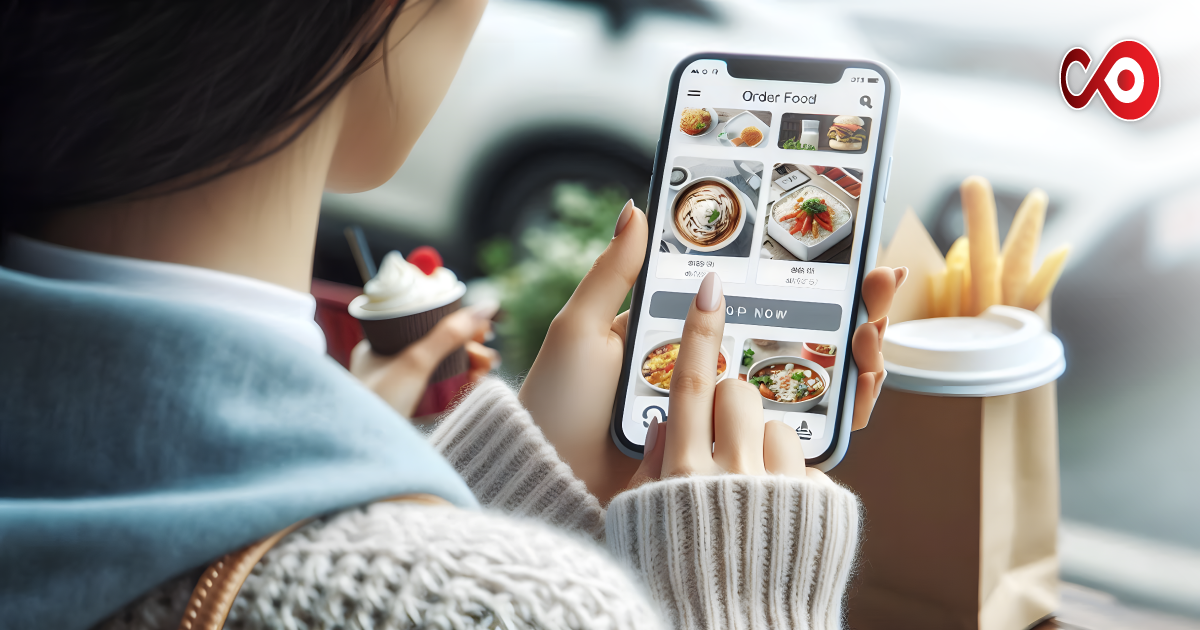
Everyone’s going digital, QR codes, online menus, flashy websites, and that’s fine. But printed menus still hit differently. They feel real. When a customer picks up a printed menu, there’s a sense of comfort and connection. It’s part of the restaurant’s atmosphere.
You can’t get that from scanning a code. People like to touch something physical. They fold it, flip it, hold it close while deciding what to order. A printed menu has weight, literally and emotionally.
And if you do takeaway menu printing, it’s even more important. Think of how many times people stick those menus on the fridge or leave them by the phone. That’s free marketing sitting in their kitchen. So when you’re printing, don’t just throw together a quick design; make it something you’re proud to hand out.
Fonts That Actually Work (and Don’t Make People Squint)
Fonts can say a lot about your restaurant without you realising it. A fancy script font might look posh, but if people can’t read it under low lighting, it’s doing more harm than good.
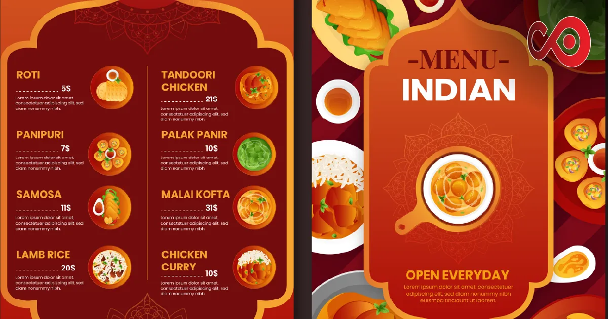
If you’ve got a modern café, diner, or family restaurant, go with simple, clean fonts like Montserrat, Open Sans, or Lato. They look fresh and are easy to read. If you’ve got something a bit more traditional, a steakhouse, fine dining, or old-school curry house, fonts like Garamond, Georgia, or Baskerville carry that timeless touch.
The best fonts for menus are the ones your customers can read at a glance. That’s it. You don’t need three or four different fonts either, one for headings and one for the item names or descriptions is more than enough. Anything more and it starts to look messy.
Think about it this way: your fonts should make reading your menu feel easy, not like trying to decode handwriting from the 1800s.
Colours That Help You Sell (Without Saying a Word)
Colours speak louder than most people realise. They set the mood before a customer even reads a word on the page.
Warm colours like red, orange, and gold are known to trigger appetite. They make people feel hungry and excited. That’s why a lot of fast-food places use them. But that doesn’t mean you can’t use them tastefully. A touch of red in the headings or a gold accent can really make your menu pop.
Green and brown shades work brilliantly for restaurants that focus on fresh ingredients or healthy dishes. They give off that “wholesome” vibe. And for more high-end places, dark navy, black, or deep burgundy bring that classy, premium feel.
But here’s a little thing people often forget: contrast. If your background and text are too similar, it’s going to be hard to read. Don’t print grey writing on beige paper and expect people to squint through it. Keep your restaurant menu colours bold and clear.
And please, if your logo is blue, don’t make the whole menu bright orange. Stick with your brand colours, it makes your restaurant look professional and consistent.
Keep Printed Menus Practical and Tough
Let’s talk about something most designers don’t, the state of menus after a week of use. Drinks spill, sauces drip, customers fold them, kids chew them (yes, really). If your menu starts peeling or fading after a few days, that’s money down the drain.
Go for menu design and printing that lasts. Matte finishes are usually best, they don’t show fingerprints as much, and they feel nice to hold. Avoid overly glossy paper unless that shiny look fits your style.
And layout matters. Don’t cram everything in. Give dishes space to breathe. Use sections, starters, mains, and desserts, and keep it simple. People like a clean layout they can glance through easily.
For takeaway menu printing, make your contact details big and easy to find. Phone number, website, delivery options, they should jump off the page. Nothing worse than a nice-looking menu where people can’t even find how to order.
A Few Honest Menu Design Tips
You don’t need a degree in design to make your menu work. Just use a bit of common sense and trust your gut.
- Make sure people can read it without glasses.
- Keep the food descriptions short but appetising. “Grilled chicken with garlic butter” sounds better than “Chicken”.
- Highlight your bestsellers or high-profit dishes, maybe use a box, a bold font, or a different colour.
- Update your printed menus regularly. If you change dishes or prices, don’t just cross things out with a pen. Customers notice that stuff.
The goal is simple, make the menu look like the food you serve. Clean, confident, and well cared for.
Why Good Menu Design Gets You Noticed (Even by Judges)
If you’ve ever thought about entering a Restaurant award, pay attention to your menu. Judges and reviewers don’t just look at the food; they look at everything, from your service to your presentation.
A well-designed menu conveys a sense of pride and professionalism. It shows you care about the details, which is exactly what awards panels love to see. Plus, customers notice it too. A neat, well-designed menu can make your restaurant feel more premium, even if your prices haven’t changed.
So yeah, your menu might not cook the food, but it definitely helps sell it.
Final Thoughts
If your menus are looking a bit tired, it’s probably time for a refresh. You don’t need to spend thousands with a design agency; just get the basics right. Use fonts people can read, colours that suit your brand, and print quality that lasts.
Think about how your customers actually use your menu; they’re not analysing it like a designer. They’re hungry, they’re browsing, and they want something that feels easy and inviting.
That’s what great menu design for restaurants in the UK is about, not being fancy, just being clear, welcoming, and true to your restaurant.
A good printed menu feels like part of the experience. It tells your story, sells your food, and leaves a little impression that lasts long after the meal’s over.
FAQs About Printed Menu Design
- What kind of fonts work best for printed menus?
Stick to easy-to-read ones like Montserrat, Garamond, or Lato. You want clear text that still feels like your brand. - What colours should I use?
Red, orange, and gold work great for appetite; green feels fresh; navy and black add elegance. Keep it simple and readable. - How often should I reprint menus?
Once a year’s a good rule. If your prices or dishes change, update sooner. Nothing puts people off like scratched-out items. - What’s the best material for printed menus?
Matte paper or laminated finishes are solid options. They’re durable and don’t look greasy. - Can a good menu really help business?
Absolutely. A smart, well-printed menu builds trust. It makes customers feel like you care, and that keeps them coming back.